
4 Todo App - 사용자 경험 개선
source: categories/study/vue-beginner-lv2/vue-beginner-lv2_4.md
4.1 모달 컴포넌트 등록
4.1.1 첫번째 개선, 인풋 박스에서 아무 값도 입력되지 않았을 때, 알람을 띄워주는 부분
<template>
  <div class="inputBox shadow">
    <input type="text" v-model="newTodoItem" v-on:keyup.enter="addTodo">
    <span class="addContainer" v-on:click="addTodo">
      <i class="fas fa-plus addBtn"></i>
    </span>
  </div>
</template>

<script>
export default {
  name: "TodoInput",
  data: function () {
    return {
      newTodoItem: ""
    }
  },
  methods: {
    addTodo: function () {
      if (this.newTodoItem !== '') {
        this.$emit('addTodoItem', this.newTodoItem);
        this.clearInput();
      } else {
        alert('type something');
      }
    },
    clearInput: function () {
      this.newTodoItem = '';
    }
  }
}
</script>

<style scoped>
.input:focus {
  outline: none;
}
.inputBox {
  background-color: #fff;
  height: 50px;
  line-height: 50px;
  border-radius: 5px;
}
.inputBox input {
  border-style: none;
  font-size: 0.9rem;
}
.addContainer {
  float: right;
  display: block;
  background: linear-gradient(to right, #6478fb, #8763fb);
  width: 3rem;
  border-radius: 0 5px 5px 0;
}
.addBtn {
  color: #ffffff;
  vertical-align: middle;
}
</style>
위와 같이 수정하면 얼럿창은 뜨지만 뭔가 허접해보인다.
좀 더 이쁘게 바꿔보자.
<!-- template for the modal component -->
<script type="text/x-template" id="modal-template">
  <transition name="modal">
    <div class="modal-mask">
      <div class="modal-wrapper">
        <div class="modal-container">

          <div class="modal-header">
            <slot name="header">
              default header
            </slot>
          </div>

          <div class="modal-body">
            <slot name="body">
              default body
            </slot>
          </div>

          <div class="modal-footer">
            <slot name="footer">
              default footer
              <button class="modal-default-button" @click="$emit('close')">
                OK
              </button>
            </slot>
          </div>
        </div>
      </div>
    </div>
  </transition>
</script>

<!-- app -->
<div id="app">
  <button id="show-modal" @click="showModal = true">Show Modal</button>
  <!-- use the modal component, pass in the prop -->
  <modal v-if="showModal" @close="showModal = false">
    <!--
      you can use custom content here to overwrite
      default content
    -->
    <h3 slot="header">custom header</h3>
  </modal>
</div>
흠.. 강의와 다르게 등장할 때 트랜지션 효과가 적용이 안되어있다.
강의할 때와 또 달라진게 있나? 버전업되면서?
여튼 등장할 때 코드적으론 트랜지션 효과처리가 되어있을 수 있지만, 실제로 트랜지션 효과가 적용되면서 등장하진 않는다. 모달이 사라질때만 트랜지션 효과가 적용되어서 사라진다.
모달 탬플릿 HTML 코드를보면, x-template이라고 되어있는데, ES5 기준.. 저희가 ES5로 하고있죠? 다만 이제 모듈 기반… 싱글파일 컴포넌트라는 .vue 파일 체계로 어플리케이션을 구현하고 있습니다.
어떻게보면 모듈화를 하고있는 것이죠.
그런데 원래 jsp라던지, 자바 어플리케이션, 제이쿼리를 쓰는 일반 HTML 파일에서 템플릿을 모듈화하려면 x-template이란걸 쓸 수 있습니다.
// register modal component
Vue.component('modal', {
  template: '#modal-template'
})

// start app
new Vue({
  el: '#app',
  data: {
    showModal: false
  }
})
위 자바스크립트 코드 template: '#modal-template' 부분에 html 태그 template로 감싸져있는 부분이 들어갑니다.
4.1.1.1 src/components/common/Modal.vue
<template>
  <transition name="modal">
    <div class="modal-mask">
      <div class="modal-wrapper">
        <div class="modal-container">

          <div class="modal-header">
            <slot name="header">
              default header
            </slot>
          </div>

          <div class="modal-body">
            <slot name="body">
              default body
            </slot>
          </div>

          <div class="modal-footer">
            <slot name="footer">
              default footer
              <button class="modal-default-button" @click="$emit('close')">
                OK
              </button>
            </slot>
          </div>
        </div>
      </div>
    </div>
  </transition>
</template>

<script>
export default {
  name: "Modal"
}
</script>

<style scoped>
.modal-mask {
  position: fixed;
  z-index: 9998;
  top: 0;
  left: 0;
  width: 100%;
  height: 100%;
  background-color: rgba(0, 0, 0, .5);
  display: table;
  transition: opacity .3s ease;
}

.modal-wrapper {
  display: table-cell;
  vertical-align: middle;
}

.modal-container {
  width: 300px;
  margin: 0px auto;
  padding: 20px 30px;
  background-color: #fff;
  border-radius: 2px;
  box-shadow: 0 2px 8px rgba(0, 0, 0, .33);
  transition: all .3s ease;
  font-family: Helvetica, Arial, sans-serif;
}

.modal-header h3 {
  margin-top: 0;
  color: #42b983;
}

.modal-body {
  margin: 20px 0;
}

.modal-default-button {
  float: right;
}

/*
 * The following styles are auto-applied to elements with
 * transition="modal" when their visibility is toggled
 * by Vue.js.
 *
 * You can easily play with the modal transition by editing
 * these styles.
 */

.modal-enter {
  opacity: 0;
}

.modal-leave-active {
  opacity: 0;
}

.modal-enter .modal-container,
.modal-leave-active .modal-container {
  -webkit-transform: scale(1.1);
  transform: scale(1.1);
}
</style>
4.1.1.2 src/components/TodoInput.vue
<template>
  <div class="inputBox shadow">
    <input type="text" v-model="newTodoItem" v-on:keyup.enter="addTodo">
    <span class="addContainer" v-on:click="addTodo">
      <i class="fas fa-plus addBtn"></i>
    </span>
    <Modal v-if="showModal" @close="showModal = false">
      <!--
        you can use custom content here to overwrite
        default content
      -->
      <h3 slot="header">custom header</h3>
    </Modal>
  </div>
</template>

<script>
import Modal from "@/components/common/Modal";

export default {
  name: "TodoInput",
  data: function () {
    return {
      newTodoItem: "",
      showModal: false,
    }
  },
  methods: {
    addTodo: function () {
      if (this.newTodoItem !== '') {
        this.$emit('addTodoItem', this.newTodoItem);
        this.clearInput();
      } else {

      }
    },
    clearInput: function () {
      this.newTodoItem = '';
    }
  },
  components: {
    Modal,
  }
}
</script>

<style scoped>
.input:focus {
  outline: none;
}
.inputBox {
  background-color: #fff;
  height: 50px;
  line-height: 50px;
  border-radius: 5px;
}
.inputBox input {
  border-style: none;
  font-size: 0.9rem;
}
.addContainer {
  float: right;
  display: block;
  background: linear-gradient(to right, #6478fb, #8763fb);
  width: 3rem;
  border-radius: 0 5px 5px 0;
}
.addBtn {
  color: #ffffff;
  vertical-align: middle;
}
</style>
4.2 [퀴즈] 모달 컴포넌트의 slot 소개 및 퀴즈 안내
모달 컴포넌트를 보시면 slot이라는 속성이 있습니다.
<template>
  <div class="inputBox shadow">
    <input type="text" v-model="newTodoItem" v-on:keyup.enter="addTodo">
    <span class="addContainer" v-on:click="addTodo">
      <i class="fas fa-plus addBtn"></i>
    </span>
    <Modal v-if="showModal" @close="showModal = false">
      <!--
        you can use custom content here to overwrite
        default content
      -->
      <h3 slot="header">custom header</h3>
    </Modal>
  </div>
</template>

<script>
import Modal from "@/components/common/Modal";

export default {
  name: "TodoInput",
  data: function () {
    return {
      newTodoItem: "",
      showModal: false,
    }
  },
  methods: {
    addTodo: function () {
      if (this.newTodoItem !== '') {
        this.$emit('addTodoItem', this.newTodoItem);
        this.clearInput();
      } else {

      }
    },
    clearInput: function () {
      this.newTodoItem = '';
    }
  },
  components: {
    Modal,
  }
}
</script>

<style scoped>
.input:focus {
  outline: none;
}
.inputBox {
  background-color: #fff;
  height: 50px;
  line-height: 50px;
  border-radius: 5px;
}
.inputBox input {
  border-style: none;
  font-size: 0.9rem;
}
.addContainer {
  float: right;
  display: block;
  background: linear-gradient(to right, #6478fb, #8763fb);
  width: 3rem;
  border-radius: 0 5px 5px 0;
}
.addBtn {
  color: #ffffff;
  vertical-align: middle;
}
</style>
<template>
  <transition name="modal">
    <div class="modal-mask">
      <div class="modal-wrapper">
        <div class="modal-container">

          <div class="modal-header">
            <slot name="header">
              default header
            </slot>
          </div>

          <div class="modal-body">
            <slot name="body">
              default body
            </slot>
          </div>

          <div class="modal-footer">
            <slot name="footer">
              default footer
              <button class="modal-default-button" @click="$emit('close')">
                OK
              </button>
            </slot>
          </div>
        </div>
      </div>
    </div>
  </transition>
</template>

<script>
export default {
  name: "Modal"
}
</script>

<style scoped>
.modal-mask {
  position: fixed;
  z-index: 9998;
  top: 0;
  left: 0;
  width: 100%;
  height: 100%;
  background-color: rgba(0, 0, 0, .5);
  display: table;
  transition: opacity .3s ease;
}

.modal-wrapper {
  display: table-cell;
  vertical-align: middle;
}

.modal-container {
  width: 300px;
  margin: 0px auto;
  padding: 20px 30px;
  background-color: #fff;
  border-radius: 2px;
  box-shadow: 0 2px 8px rgba(0, 0, 0, .33);
  transition: all .3s ease;
  font-family: Helvetica, Arial, sans-serif;
}

.modal-header h3 {
  margin-top: 0;
  color: #42b983;
}

.modal-body {
  margin: 20px 0;
}

.modal-default-button {
  float: right;
}

/*
 * The following styles are auto-applied to elements with
 * transition="modal" when their visibility is toggled
 * by Vue.js.
 *
 * You can easily play with the modal transition by editing
 * these styles.
 */

.modal-enter {
  opacity: 0;
}

.modal-leave-active {
  opacity: 0;
}

.modal-enter .modal-container,
.modal-leave-active .modal-container {
  -webkit-transform: scale(1.1);
  transform: scale(1.1);
}
</style>
slot은 상당히 유용한 vue의 기능입니다.
특정 컴포넌트의 일부 UI를 다시 정의할 수 있는 기능입니다.
slot은 정말 중요한 기능입니다.
나중에 scoped slot이라고해서 컨텍스트로 접근하는.. 그래서 데이터를 뿌려주고해서 좀 더 유연하게 UI를 재사용 할 수 있는 부분이있는데,
그런 것들을 이해하시기 위해선 slot에 대해 기본적으로 이해하셔야돼고,
실제로 실무에서도 많이 사용하는 vue의 기능이기 때문에 알아두시는 것이 좋습니다.
바디: 무언가를 입력하세요.
푸터: copy right
slot을 활용해서 모달의 slot을 위 내용으로 갈아끼워넣어보세요.
4.3 [퀴즈] slot 퀴즈 풀이 및 모달 컴포넌트 기능 구현
4.3.1 내가 푼 답
<template>
  <div class="inputBox shadow">
    <input type="text" v-model="newTodoItem" v-on:keyup.enter="addTodo">
    <span class="addContainer" v-on:click="addTodo">
      <i class="fas fa-plus addBtn"></i>
    </span>
    <Modal v-if="showModal" @close="showModal = false">
      <!--
        you can use custom content here to overwrite
        default content
      -->
      <h3 slot="header">경고!</h3>
      <div slot="body">
        무언가를 입력하세요.
      </div>
      <div slot="footer">
        copy right
        <button class="modal-default-button" @click="closeModal">
          닫기
        </button>
      </div>
    </Modal>
  </div>
</template>

<script>
import Modal from "@/components/common/Modal";

export default {
  name: "TodoInput",
  data: function () {
    return {
      newTodoItem: "",
      showModal: false,
    }
  },
  methods: {
    addTodo: function () {
      if (this.newTodoItem !== '') {
        this.$emit('addTodoItem', this.newTodoItem);
        this.clearInput();
      } else {
        this.showModal = !this.showModal;
      }
    },
    clearInput: function () {
      this.newTodoItem = '';
    },
    closeModal: function () {
      this.showModal = false;
    }
  },
  components: {
    Modal,
  }
}
</script>

<style scoped>
.input:focus {
  outline: none;
}
.inputBox {
  background-color: #fff;
  height: 50px;
  line-height: 50px;
  border-radius: 5px;
}
.inputBox input {
  border-style: none;
  font-size: 0.9rem;
}
.addContainer {
  float: right;
  display: block;
  background: linear-gradient(to right, #6478fb, #8763fb);
  width: 3rem;
  border-radius: 0 5px 5px 0;
}
.addBtn {
  color: #ffffff;
  vertical-align: middle;
}
</style>
4.3.2 강의 답
<template>
  <div class="inputBox shadow">
    <input type="text" v-model="newTodoItem" v-on:keyup.enter="addTodo">
    <span class="addContainer" v-on:click="addTodo">
      <i class="fas fa-plus addBtn"></i>
    </span>
    <Modal v-if="showModal">
      <h3 slot="header">
        경고!
        <!-- @는 v-on의 간소화된 문법입니다. short hand -->
        <i class="fas fa-times closeModalBtn" @click="showModal=false"></i>
      </h3>
      <div slot="body">
        무언가를 입력하세요.
      </div>
    </Modal>
  </div>
</template>

<script>
import Modal from "@/components/common/Modal";

export default {
  name: "TodoInput",
  data: function () {
    return {
      newTodoItem: "",
      showModal: false,
    }
  },
  methods: {
    addTodo: function () {
      if (this.newTodoItem !== '') {
        this.$emit('addTodoItem', this.newTodoItem);
        this.clearInput();
      } else {
        this.showModal = !this.showModal;
      }
    },
    clearInput: function () {
      this.newTodoItem = '';
    },
  },
  components: {
    Modal,
  }
}
</script>

<style scoped>
.input:focus {
  outline: none;
}
.inputBox {
  background-color: #fff;
  height: 50px;
  line-height: 50px;
  border-radius: 5px;
}
.inputBox input {
  border-style: none;
  font-size: 0.9rem;
}
.addContainer {
  float: right;
  display: block;
  background: linear-gradient(to right, #6478fb, #8763fb);
  width: 3rem;
  border-radius: 0 5px 5px 0;
}
.addBtn {
  color: #ffffff;
  vertical-align: middle;
}
.closeModalBtn {
  color: #42b983;
}
</style>
모달창 관련이슈 해결
위와 같이 작성하면 v-if로 처음 모달이 등장할 때 transition 효과를 일으키는 클래스들이 붙질않는다.
vue 공식 사이트의 예시 모달도 그렇고, 강의 코드도 그렇고 현재 기준으로는 처음 모달이 등장할 때 트랜지션 효과가 붙질않는 상태이다.
이를 props를 내려주는 방식으로 해결하였다.
그런데 강의에선 되는데 왜 지금은 안되는걸까..
그 사이에 버전업되면서 바뀐건가..?
궁금하지만 모르겠다. 일단 해결은 했으니..
강의속 vue 버전은 2.5.16
현재 내 실습 vue 버전은 2.6.14
<template>
  <transition name="modal">
    <div class="modal-mask" v-if="propsdata">
      <div class="modal-wrapper">
        <div class="modal-container">

          <div class="modal-header">
            <slot name="header">
              default header
            </slot>
          </div>

          <div class="modal-body">
            <slot name="body">
              default body
            </slot>
          </div>
        </div>
      </div>
    </div>
  </transition>
</template>

<script>
export default {
  name: "Modal",
  props: ['propsdata']
}
</script>

<style scoped>
.modal-mask {
  position: fixed;
  z-index: 9998;
  top: 0;
  left: 0;
  width: 100%;
  height: 100%;
  background-color: rgba(0, 0, 0, 0.5);
  display: table;
  transition: opacity 0.3s ease;
}

.modal-wrapper {
  display: table-cell;
  vertical-align: middle;
}

.modal-container {
  width: 300px;
  margin: 0px auto;
  padding: 20px 30px;
  background-color: #fff;
  border-radius: 2px;
  box-shadow: 0 2px 8px rgba(0, 0, 0, 0.33);
  transition: all 0.3s ease;
  font-family: Helvetica, Arial, sans-serif;
}

.modal-header h3 {
  margin-top: 0;
  color: #42b983;
}

.modal-body {
  margin: 20px 0;
}

.modal-default-button {
  float: right;
}

/*
 * The following styles are auto-applied to elements with
 * transition="modal" when their visibility is toggled
 * by Vue.js.
 *
 * You can easily play with the modal transition by editing
 * these styles.
 */

.modal-enter {
  opacity: 0;
}

.modal-leave-active {
  opacity: 0;
}

.modal-enter .modal-container,
.modal-leave-active .modal-container {
  -webkit-transform: scale(1.1);
  transform: scale(1.1);
}
</style>
<template>
  <div class="inputBox shadow">
    <input type="text" v-model="newTodoItem" v-on:keyup.enter="addTodo">
    <span class="addContainer" v-on:click="addTodo">
      <i class="fas fa-plus addBtn"></i>
    </span>
    <Modal v-bind:propsdata="showModal">
      <h3 slot="header">
        경고!
        <!-- @는 v-on의 간소화된 문법입니다. short hand -->
        <i class="fas fa-times closeModalBtn" @click="showModal=false"></i>
      </h3>
      <div slot="body">
        무언가를 입력하세요.
      </div>
    </Modal>
  </div>
</template>

<script>
import Modal from "@/components/common/Modal";

export default {
  name: "TodoInput",
  data: function () {
    return {
      newTodoItem: "",
      showModal: false,
    }
  },
  methods: {
    addTodo: function () {
      if (this.newTodoItem !== '') {
        this.$emit('addTodoItem', this.newTodoItem);
        this.clearInput();
      } else {
        this.showModal = !this.showModal;
      }
    },
    clearInput: function () {
      this.newTodoItem = '';
    },
  },
  components: {
    Modal,
  }
}
</script>

<style scoped>
.input:focus {
  outline: none;
}
.inputBox {
  background-color: #fff;
  height: 50px;
  line-height: 50px;
  border-radius: 5px;
}
.inputBox input {
  border-style: none;
  font-size: 0.9rem;
}
.addContainer {
  float: right;
  display: block;
  background: linear-gradient(to right, #6478fb, #8763fb);
  width: 3rem;
  border-radius: 0 5px 5px 0;
}
.addBtn {
  color: #ffffff;
  vertical-align: middle;
}
.closeModalBtn {
  color: #42b983;
}
</style>
4.4 트랜지션 소개 및 구현
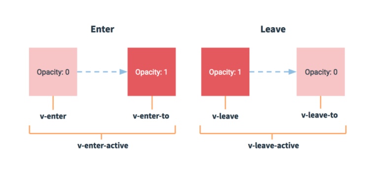
일반적으로 v-enter-to, v-leave / v-enter, v-leave-to 이렇게 묶어서 적용합니다.
위 List Transition에 소개된 애니메이션을 TodoList 컴포넌트에 그대로 적용해보겠습니다.
.list-item {
  display: inline-block;
  margin-right: 10px;
}
.list-enter-active, .list-leave-active {
  transition: all 1s;
}
.list-enter, .list-leave-to /* .list-leave-active below version 2.1.8 */ {
  opacity: 0;
  transform: translateY(30px);
}
<div id="list-demo">
  <button v-on:click="add">Add</button>
  <button v-on:click="remove">Remove</button>
  <transition-group name="list" tag="p">
    <span v-for="item in items" v-bind:key="item" class="list-item">

    </span>
  </transition-group>
</div>
transitionortransition-group태그의name프로퍼티: CSS 속성명과 직접적인 연관이 있는 속성transitionortransition-group태그의tag프로퍼티: 말 그대로 HTML 태그를 의미한다.
위의tag="p"는 현재transition-group태그가p태그로 치환됨을 의미한다.
<template>
  <div>
    <transition-group name="list" tag="ul">
      <li v-for="(todoItem, index) in propsdata" v-bind:key="todoItem.item" class="shadow">
        <i class="checkBtn fas fa-check" v-bind:class="{checkBtnCompleted: todoItem.completed}" v-on:click="toggleComplete(todoItem, index)"></i>
        <span v-bind:class="{textCompleted: todoItem.completed}">{{todoItem.item}}</span>
        <span class="removeBtn" v-on:click="removeTodo(todoItem, index)">
            <i class="fas fa-trash-alt"></i>
          </span>
      </li>
    </transition-group>
  </div>
</template>

<script>
export default {
  name: "TodoList",
  props: ['propsdata'],
  methods: {
    removeTodo(todoItem, index) {
      this.$emit('removeItem', todoItem, index);
    },
    toggleComplete(todoItem, index) {
      this.$emit('toggleItem', todoItem, index);
    }
  },
}
</script>

<style scoped>
ul {
  list-style-type: none;
  padding-left: 0;
  margin-top: 0;
  text-align: left;
}
li {
  display: flex;
  min-height: 50px;
  height: 50px;
  line-height: 50px;
  margin: 0.5rem 0;
  padding: 0 0.9rem;
  background-color: #ffffff;
  border-radius: 5px;
}
.checkBtn {
  line-height: 45px;
  color: #62acde;
  margin-right: 5px;
}
.checkBtnCompleted {
  color: #b3adad;
}
.textCompleted {
  text-decoration: line-through;
  color: #b3adad;
}
.removeBtn {
  margin-left: auto;
  color: #de4343;
}
/* 리스트아이템 트랜지션 효과 */
.list-item {
  display: inline-block;
  margin-right: 10px;
}
.list-enter-active, .list-leave-active {
  transition: all 1s;
}
.list-enter, .list-leave-to /* .list-leave-active below version 2.1.8 */ {
  opacity: 0;
  transform: translateY(30px);
}
</style>