
26 게시글 페이지 구현하기 - 게시글 페이지 반응형 디자인 구현하기
source: categories/study/gatsby/gatsby_9-17.md
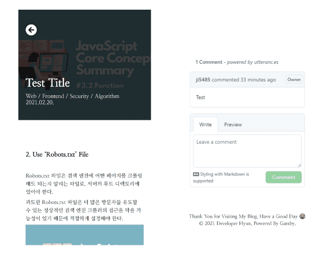
반응형 디자인 구현 결과
게시글 페이지 반응형 디자인 구현 결과는 아래 두 사진과 같습니다.
기존 디자인과 크게 달라진 것 없이, 각 폰트 사이즈와 Padding 및 Margin 값만 변경되었습니다.
또, 마크다운 커스텀 스타일이 약간 변경되었습니다.
마크다운 커스텀 스타일 변경하기
전체적으로 폰트 크기를 낮춰주겠습니다.
또, 고정되어 있는 이미지 크기를 유동적으로 변경되도록 적용해준 후 특정 요소의 Margin, Padding 값을 변경해주겠습니다.
아래와 같이 코드를 변경해주세요.
src/components/Post/PostContent.tsx
// ...

const MarkdownRenderer = styled.div`
  // Renderer Style
  display: flex;
  flex-direction: column;
  width: 768px;
  margin: 0 auto;
  padding: 100px 0;
  word-break: break-all;

  // Markdown Style
  line-height: 1.8;
  font-size: 16px;
  font-weight: 400;

  // Apply Padding Attribute to All Elements
  p {
    padding: 3px 0;
  }

  // Adjust Heading Element Style
  h1,
  h2,
  h3 {
    font-weight: 800;
    margin-bottom: 30px;
  }

  * + h1,
  * + h2,
  * + h3 {
    margin-top: 80px;
  }

  hr + h1,
  hr + h2,
  hr + h3 {
    margin-top: 0;
  }

  h1 {
    font-size: 30px;
  }

  h2 {
    font-size: 25px;
  }

  h3 {
    font-size: 20px;
  }

  // Adjust Quotation Element Style
  blockquote {
    margin: 30px 0;
    padding: 5px 15px;
    border-left: 2px solid #000000;
    font-weight: 800;
  }

  // Adjust List Element Style
  ol,
  ul {
    margin-left: 20px;
    padding: 30px 0;
  }

  // Adjust Horizontal Rule style
  hr {
    border: 1px solid #000000;
    margin: 100px 0;
  }

  // Adjust Link Element Style
  a {
    color: #4263eb;
    text-decoration: underline;
  }

  // Adjust Code Style
  pre[class*='language-'] {
    margin: 30px 0;
    padding: 15px;
    font-size: 15px;

    ::-webkit-scrollbar-thumb {
      background: rgba(255, 255, 255, 0.5);
      border-radius: 3px;
    }
  }

  code[class*='language-'],
  pre[class*='language-'] {
    tab-size: 2;
  }

  // Markdown Responsive Design
  @media (max-width: 768px) {
    width: 100%;
    padding: 80px 20px;
    line-height: 1.6;
    font-size: 14px;

    h1 {
      font-size: 23px;
    }

    h2 {
      font-size: 20px;
    }

    h3 {
      font-size: 17px;
    }

    img {
      width: 100%;
    }

    hr {
      margin: 50px 0;
    }
  }
`

// ...
상단 부분 반응형 디자인 구현하기
먼저, 높이를 조절해주겠습니다.
PC 화면에서는 400px로 되어있던 것을 모바일 화면에서는 300px로 띄워주게 구현하겠습니다.
src/components/Post/PostHead.tsx
// ...

const PostHeadWrapper = styled.div`
  position: relative;
  width: 100%;
  height: 400px;

  @media (max-width: 768px) {
    height: 300px;
  }
`

const BackgroundImage = styled((props: GatsbyImgProps) => (
  <GatsbyImage {...props} style= />
))`
  z-index: -1;
  width: 100%;
  height: 400px;
  object-fit: cover;
  filter: brightness(0.25);

  @media (max-width: 768px) {
    height: 300px;
  }
`

// ...
그 다음으로 변경해줘야 할 부분은 카테고리와 날짜를 출력하는 컴포넌트 부분입니다.
이를 하나의 라인 양 끝에 출력하던 것을 다른 라인의 왼쪽 정렬하여 출력하는 것으로 변경해주겠습니다.
또, 폰트와 아이콘의 크기를 전체적으로 조금씩 줄여주겠습니다.
src/components/PostHeadInfo.tsx
// ...

const PostHeadInfoWrapper = styled.div`
  display: flex;
  flex-direction: column;
  width: 768px;
  height: 100%;
  margin: 0 auto;
  padding: 60px 0;
  color: #ffffff;

  @media (max-width: 768px) {
    width: 100%;
    padding: 40px 20px;
  }
`

const PrevPageIcon = styled.div`
  display: grid;
  place-items: center;
  width: 40px;
  height: 40px;
  border-radius: 50%;
  background: #ffffff;
  color: #000000;
  font-size: 22px;
  cursor: pointer;
  box-shadow: 0 0 10px rgba(0, 0, 0, 0.3);

  @media (max-width: 768px) {
    width: 30px;
    height: 30px;
    font-size: 18px;
  }
`

const Title = styled.div`
  display: -webkit-box;
  overflow: hidden;
  overflow-wrap: break-word;
  margin-top: auto;
  text-overflow: ellipsis;
  white-space: normal;
  -webkit-line-clamp: 2;
  -webkit-box-orient: vertical;
  font-size: 45px;
  font-weight: 800;

  @media (max-width: 768px) {
    font-size: 30px;
  }
`

const PostData = styled.div`
  display: flex;
  justify-content: space-between;
  align-items: center;
  margin-top: 10px;
  font-size: 18px;
  font-weight: 700;

  @media (max-width: 768px) {
    flex-direction: column;
    align-items: flex-start;
    font-size: 15px;
    font-weight: 400;
  }
`

// ...
CommentWidget 컴포넌트 반응형 디자인 구현하기
Utterances 위젯은 기본적으로 반응형 디자인이 적용되어있기 때문에 양 옆의 20px 만큼의 Padding값만 설정해주겠습니다.
src/components/Post/CommentWidget.tsx
import React, { createRef, FunctionComponent, useEffect } from 'react'
import styled from '@emotion/styled'

// ...

const UtterancesWrapper = styled.div`
  @media (max-width: 768px) {
    padding: 0 20px;
  }
`

const CommentWidget: FunctionComponent = function () {
  // ...

  return <UtterancesWrapper ref={element} />
}

export default CommentWidget