
11 글 목록을 띄워 줄 메인 페이지 구현하기 - 게시글 목록 부분 컴포넌트 구현하기
source: categories/study/gatsby/gatsby_9-02.md
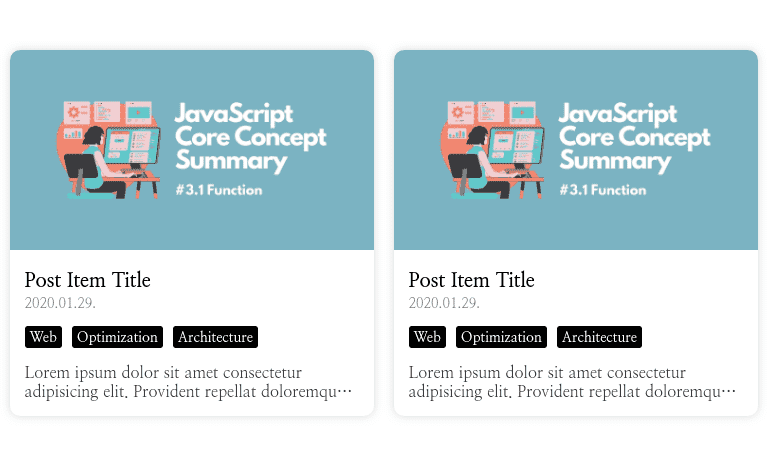
게시글 목록 구현 결과물
이번 챕터에서는 포스트 아이템과 목록 부분을 구현해보겠습니다.
아래와 같이 데스크탑 화면 기준 2줄로 포스트 아이템이 뜨도록 구현해보겠습니다.
게시글 목록 부분 컴포넌트 구현하기
해당 부분은 CSS의 Grid 속성에 대해서 알고 있다면 되게 간단한 부분입니다.
저희는 포스트 아이템을 2줄로 띄워주는 것이 목적이기 때문에 다음과 같이 포스트 아이템들을 감쌀 Styled Component를 정의해주겠습니다.
다음과 같이 PostList.tsx 파일을 작성해주세요.
src/components/Main/PostList.tsx
import React, { FunctionComponent } from 'react'
import styled from '@emotion/styled'

const PostListWrapper = styled.div`
  display: grid;
  grid-template-columns: 1fr 1fr;
  grid-gap: 20px;
  width: 768px;
  margin: 0 auto;
  padding: 50px 0 100px;
`

const PostList: FunctionComponent = function () {
  return <PostListWrapper></PostListWrapper>
}

export default PostList
src/pages/index.tsx
import React, { FunctionComponent } from 'react'
import styled from '@emotion/styled'
import GlobalStyle from 'components/Common/GlobalStyle'
import Footer from 'components/Common/Footer'
import CategoryList from 'components/Main/CategoryList'
import Introduction from 'components/Main/Introduction'
import PostList from 'components/Main/PostList'

const CATEGORY_LIST = {
  All: 5,
  Web: 3,
  Mobile: 2,
}

const Container = styled.div`
  display: flex;
  flex-direction: column;
  height: 100%;
`

const IndexPage: FunctionComponent = function () {
  return (
    <Container>
      <GlobalStyle />
      <Introduction />
      <CategoryList selectedCategory="Web" categoryList={CATEGORY_LIST} />
      <PostList />
      <Footer />
    </Container>
  )
}

export default IndexPage
해당 부분은 이 코드가 끝입니다.
만약 Grid 속성에 대해 잘 모르시는 분은 검색을 통해 여기에서 사용한 속성이 어떤 역할을 하는지 알아보고 오시는 것을 추천드립니다.
포스트 아이템 컴포넌트 구현하기
가장 먼저 각 아이템마다 띄워줄 데이터는 어떤 것이 있는지 알아야 합니다.
저희는 아래와 같은 데이터를 하나의 컴포넌트에 모두 담을 것입니다.
- 포스트 제목
- 업로드 날짜
- 카테고리 목록
- 포스트 요약
- 썸네일 이미지
- 포스트 링크
해당 데이터는 모두 부모 컴포넌트로부터 Props로 받을 것이므로 다음과 같이 PostItem.tsx 파일에 타입을 지정해줍시다.
src/components/Main/PostItem.tsx
import React, { FunctionComponent } from 'react'

type PostItemProps = {
  title: string
  date: string
  categories: string[]
  summary: string
  thumbnail: string
  link: string
}

const PostItem: FunctionComponent<PostItemProps> = function ({
  title,
  date,
  categories,
  summary,
  thumbnail,
  link,
}) {
  return <div />
}

export default PostItem
그리고 실시간으로 포스트 아이템 스타일을 확인하기 위해 부모 컴포넌트인 PostList 컴포넌트에서 해당 컴포넌트를 불러와 데이터를 넘겨주겠습니다.
src/components/Main/PostList.tsx
import React, { FunctionComponent } from 'react'
import styled from '@emotion/styled'
import PostItem from 'components/Main/PostItem'

const POST_ITEM_DATA = {
    title: 'Post Item Title',
    date: '2020.01.29.',
    categories: ['Web', 'Frontend', 'Testing'],
    summary:
        'Lorem ipsum dolor sit amet consectetur adipisicing elit. Provident repellat doloremque fugit quis rem temporibus! Maxime molestias, suntrem debitis odit harum impedit. Modi cupiditate harum dignissimos eos in corrupti!',
    thumbnail:
        'https://ji5485.github.io/static/e4f34c558ae8e8235ff53b0311085796/4d854/javascript-core-concept-summary-function-1.webp',
    link: 'https://www.google.co.kr/',
}

const PostListWrapper = styled.div`
  display: grid;
  grid-template-columns: 1fr 1fr;
  grid-gap: 20px;
  width: 768px;
  margin: 0 auto;
  padding: 50px 0 100px;
`

const PostList: FunctionComponent = function () {
  return (
    <PostListWrapper>
      <PostItem {...POST_ITEM_DATA} />
      <PostItem {...POST_ITEM_DATA} />
      <PostItem {...POST_ITEM_DATA} />
      <PostItem {...POST_ITEM_DATA} />
    </PostListWrapper>
  )
}

export default PostList
그럼 이제 본격적으로 포스트 아이템 컴포넌트를 구현해봅시다.
가장 먼저 포스트 아이템에 들어갈 컨텐츠를 모두 감쌀 Wrapper 컴포넌트를 정의해봅시다.
해당 컴포넌트는 Props로 받은 링크를 연결해주기 위해 Gatsby Link 컴포넌트를 기반으로 구현할 것입니다.
src/components/Main/PostItem.tsx
import React, { FunctionComponent } from 'react'
import styled from '@emotion/styled'
import { Link } from 'gatsby'

type PostItemProps = {
  title: string
  date: string
  categories: string[]
  summary: string
  thumbnail: string
  link: string
}

const PostItemWrapper = styled(Link)`
  display: flex;
  flex-direction: column;
  border-radius: 10px;
  box-shadow: 0 0 8px rgba(0, 0, 0, 0.15);
  transition: 0.3s box-shadow;
  cursor: pointer;

  &:hover {
    box-shadow: 0 0 10px rgba(0, 0, 0, 0.3);
  }
`

const PostItem: FunctionComponent<PostItemProps> = function ({
  title,
  date,
  categories,
  summary,
  thumbnail,
  link,
}) {
  return <PostItemWrapper></PostItemWrapper>
}

export default PostItem
그 다음으로는 썸네일 이미지 부분을 구현해주겠습니다.
해당 이미지의 너비는 부모 컴포넌트의 가로 길이에 따라 가변적으로 맞춰지지만, 높이는 그렇지 않기 때문에 200px로 맞춰주겠습니다.
src/components/Main/PostItem.tsx
import React, { FunctionComponent } from 'react'
import styled from '@emotion/styled'
import { Link } from 'gatsby'

type PostItemProps = {
  title: string
  date: string
  categories: string[]
  summary: string
  thumbnail: string
  link: string
}

const PostItemWrapper = styled(Link)`
  display: flex;
  flex-direction: column;
  border-radius: 10px;
  box-shadow: 0 0 8px rgba(0, 0, 0, 0.15);
  transition: 0.3s box-shadow;
  cursor: pointer;

  &:hover {
    box-shadow: 0 0 10px rgba(0, 0, 0, 0.3);
  }
`

const ThumbnailImage = styled.img`
  width: 100%;
  height: 200px;
  border-radius: 10px 10px 0 0;
  object-fit: cover;
`

const PostItem: FunctionComponent<PostItemProps> = function ({
  title,
  date,
  categories,
  summary,
  thumbnail,
  link,
}) {
  return (
    <PostItemWrapper>
      <ThumbnailImage src={thumbnail} alt="Post Item Image" />
    </PostItemWrapper>
  )
}

export default PostItem
이제 포스트 아이템에 들어가는 컨텐츠 부분을 작성해주겠습니다.
먼저, 컨텐츠를 모두 감싸는 Wrapper 컴포넌트를 하나 정의해주겠습니다.
src/components/Main/PostItem.tsx
// ...

const PostItemContent = styled.div`
  flex: 1;
  display: flex;
  flex-direction: column;
  padding: 15px;
`

const PostItem: FunctionComponent<PostItemProps> = function ({
  title,
  date,
  categories,
  summary,
  thumbnail,
  link,
}) {
  return (
    <PostItemWrapper>
      <ThumbnailImage src={thumbnail} alt="Post Item Image" />

      <PostItemContent></PostItemContent>
    </PostItemWrapper>
  )
}

export default PostItem
그럼 이제 PostItemContent 컴포넌트에 들어갈 제목, 날짜, 카테고리, 요약 데이터를 위한 Styled Component를 정의하겠습니다.
src/components/Main/PostItem.tsx
...

const Title = styled.div`
  display: -webkit-box;
  overflow: hidden;
  margin-bottom: 3px;
  text-overflow: ellipsis;
  white-space: normal;
  overflow-wrap: break-word;
  -webkit-line-clamp: 2;
  -webkit-box-orient: vertical;
  font-size: 20px;
  font-weight: 700;
`

const Date = styled.div`
  font-size: 14px;
  font-weight: 400;
  opacity: 0.7;
`

const Category = styled.div`
  display: flex;
  flex-wrap: wrap;
  margin-top: 10px;
  margin: 10px -5px;
`

const CategoryItem = styled.div`
  margin: 2.5px 5px;
  padding: 3px 5px;
  border-radius: 3px;
  background: black;
  font-size: 14px;
  font-weight: 700;
  color: white;
`

const Summary = styled.div`
  display: -webkit-box;
  overflow: hidden;
  margin-top: auto;
  text-overflow: ellipsis;
  white-space: normal;
  overflow-wrap: break-word;
  -webkit-line-clamp: 2;
  -webkit-box-orient: vertical;
  font-size: 16px;
  opacity: 0.8;
`

const PostItem: FunctionComponent<PostItemProps> = function ({
  title,
  date,
  categories,
  summary,
  thumbnail,
  link,
}) {
  return (
    <PostItemWrapper>
      <ThumbnailImage src={thumbnail} alt="Post Item Image" />

      <PostItemContent></PostItemContent>
    </PostItemWrapper>
  )
}

export default PostItem
제목과 요약 부분은 최대 2줄이 넘지 않도록 정의해주었습니다.
그 외의 CSS 속성에 대해 모르는 것이 있다면 어떤 역할을 하는지 찾아보고 오시는 것을 추천드립니다.
그럼 이제 Props로 받은 데이터를 화면에 출력해주도록 구현해봅시다.
src/components/Main/PostItem.tsx
// ...

const PostItem: FunctionComponent<PostItemProps> = function ({
  title,
  date,
  categories,
  summary,
  thumbnail,
  link,
}) {
  return (
    <PostItemWrapper to={link}>
      <ThumbnailImage src={thumbnail} alt="Post Item Image" />

      <PostItemContent>
        <Title>{title}</Title>
        <Date>{date}</Date>
        <Category>
          {categories.map(category => (
            <CategoryItem key={category}>{category}</CategoryItem>
          ))}
        </Category>
        <Summary>{summary}</Summary>
      </PostItemContent>
    </PostItemWrapper>
  )
}

export default PostItem
여기까지 끝났으면 다음 사진과 같이 포스트 아이템이 잘 뜨는지 확인해주세요.