
23 게시글 페이지 구현하기 - 게시글 페이지 상단 부분 구현하기
source: categories/study/gatsby/gatsby_9-14.md
이번 챕터에서 구현할 컴포넌트 결과물
게시글 페이지의 상단 부분에는 썸네일 이미지, 제목, 카테고리, 날짜와 같이 기본적인 게시글 정보들이 들어갈 것입니다.
따라서 이번 챕터에서는 아래 그림과 같이 상단 부분을 구현해보겠습니다.
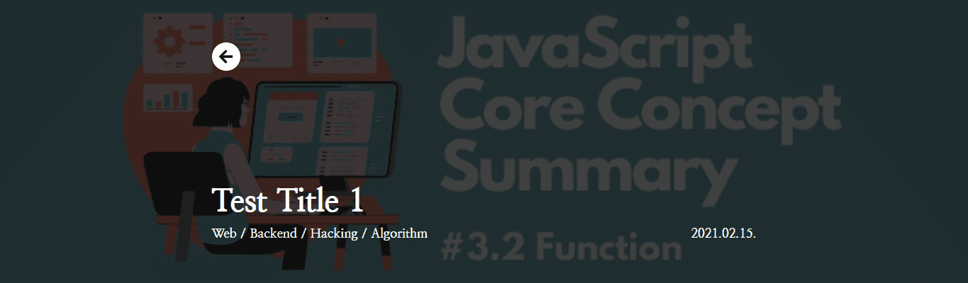
썸네일 이미지 배경화면 구현하기
위의 구현 결과에서 볼 수 있듯이 썸네일 이미지를 배경화면으로 사용했습니다.
따라서 gatsby-plugin-image 라이브러리를 통해 해당 부분을 구현하겠습니다.
게시글 페이지에서 사용될 컴포넌트를 저장하기 위해 components 디렉토리에 Post라는 이름의 디렉토리를 생성한 후, 배경화면을 구현하기 위한 PostHead.tsx 파일을 만들어주세요.
그리고 다음과 같이 코드를 추가해주세요.
src/components/Post/PostHead.tsx
import React, { FunctionComponent } from 'react'
import styled from '@emotion/styled'
import { GatsbyImage, IGatsbyImageData } from 'gatsby-plugin-image'

type GatsbyImgProps = {
  image: IGatsbyImageData
  alt: string
  className?: string
}

type PostHeadProps = {
  thumbnail: IGatsbyImageData
}

const PostHeadWrapper = styled.div`
  position: relative;
  width: 100%;
  height: 400px;
`

const BackgroundImage = styled((props: GatsbyImgProps) => (
  <GatsbyImage {...props} style= />
))`
  z-index: -1;
  width: 100%;
  height: 400px;
  object-fit: cover;
  filter: brightness(0.25);
`

const PostHead: FunctionComponent<PostHeadProps> = function ({
  thumbnail,
}) {
  return (
    <PostHeadWrapper>
      <BackgroundImage image={thumbnail} alt="thumbnail" />
    </PostHeadWrapper>
  )
}

export default PostHead
여기서 BackgroundImage 컴포넌트를 확인해보면, styled(GatsbyImage) 과 같이 넘기지 않고 함수 내부에서 props를 받아 스타일과 함께 GatsbyImage 컴포넌트에 넘겨주도록 구현했습니다.
인라인으로 정의된 스타일을 컴포넌트 스타일과 같이 작성해주고, 윗 문장과 같이 간단하게 구현할 수 있었을 것 같은데 그렇게 구현하지 않은 이유는 무엇일까요?
바로 gatsby-plugin-image 라이브러리에서 제공해주는 GatsbyImage 컴포넌트에는 기본적으로 적용되어있는 인라인 스타일이 존재하는데, 인라인 스타일은 !important 속성이 없으면 스타일 적용 순위에서 밀리기 때문입니다.
하지만 !important 속성은 가능한 사용하지 말아야 하는 속성이기 때문에 위의 코드와 같이 직접 인라인으로 포지션 스타일을 넘겨주었습니다.
여기까지 한 후, 포스트 템플릿 컴포넌트에서 저희가 구현한 컴포넌트를 불러와 적용해봅시다.
src/templates/post_template.tsx
import React, { FunctionComponent } from 'react'
import { graphql } from 'gatsby'
import { PostPageItemType } from 'types/PostItem.types' // 바로 아래에서 정의할 것입니다
import Template from 'components/Common/Template'
import PostHead from 'components/Post/PostHead'

type PostTemplateProps = {
  data: {
    allMarkdownRemark: {
      edges: PostPageItemType[] // 존재하지 않는 타입이므로 에러가 발생하지만 일단 작성해주세요
    }
  }
}

const PostTemplate: FunctionComponent<PostTemplateProps> = function ({
  data: {
    allMarkdownRemark: { edges },
  },
}) {
  const {
    node: {
      html,
      frontmatter: {
        title,
        summary, // 나중에 사용할 예정입니다!
        date,
        categories,
        thumbnail: {
          childImageSharp: { gatsbyImageData },
        },
      },
    },
  } = edges[0]

  return (
    <Template>
      <PostHead
        title={title}
        date={date}
        categories={categories}
        thumbnail={gatsbyImageData}
      />
    </Template>
  )
}

// ...
src/templates/PostItem.Types.ts
// ...

export type PostPageItemType = {
  node: {
    html: string
    frontmatter: PostFrontmatterType
  }
}
여기까지 한 후, 로컬 서버를 실행해 썸네일 이미지가 잘 로딩되는지 확인해보세요.
게시글 정보 화면에 띄워주기
시작하기 전, 상단에 왼쪽 화살표 모양의 아이콘이 있는 버튼이 존재한다는 것을 알 수 있습니다.
해당 버튼은 뒤로 가기 기능을 위해 만들어놓은 버튼인데, 여기에서 사용되는 아이콘을 위해 아이콘 라이브러리인 FontAwesome 라이브러리를 설치해주겠습니다.
다음 커맨드를 입력해 필요한 라이브러리를 모두 설치해주세요.
yarn add @fortawesome/fontawesome-svg-core @fortawesome/free-solid-svg-icons @fortawesome/react-fontawesome
그리고 Post 디렉토리에 PostHeadInfo.tsx 파일을 생성한 후, 다음과 같이 코드를 추가해주세요.
import React, { FunctionComponent } from 'react'
import styled from '@emotion/styled'
import { FontAwesomeIcon } from '@fortawesome/react-fontawesome'
import { faArrowLeft } from '@fortawesome/free-solid-svg-icons'

export type PostHeadInfoProps = {
  title: string
  date: string
  categories: string[]
}

const PostHeadInfoWrapper = styled.div`
  display: flex;
  flex-direction: column;
  width: 768px;
  height: 100%;
  margin: 0 auto;
  padding: 60px 0;
  color: #ffffff;
`

const PrevPageIcon = styled.div`
  display: grid;
  place-items: center;
  width: 40px;
  height: 40px;
  border-radius: 50%;
  background: #ffffff;
  color: #000000;
  font-size: 22px;
  cursor: pointer;
  box-shadow: 0 0 10px rgba(0, 0, 0, 0.3);
`

const PostHeadInfo: FunctionComponent<PostHeadInfoProps> = function ({
  title,
  date,
  categories,
}) {
  const goBackPage = () => window.history.back()

  return (
    <PostHeadInfoWrapper>
      <PrevPageIcon onClick={goBackPage}>
        <FontAwesomeIcon icon={faArrowLeft} />
      </PrevPageIcon>
    </PostHeadInfoWrapper>
  )
}

export default PostHeadInfo
React에서의 FontAwesome 라이브러리 사용법은 따로 설명하지 않겠습니다.
따라서 기본적인 사용 방법을 알고 싶다면 공식 문서를 확인해주세요.
저희는 이렇게 뒤로 가기 버튼을 구현했습니다.
이제 해당 컴포넌트를 PostHead 컴포넌트에서 불러와 사용해봅시다.
src/components/Post/PostHead.tsx
// ...

import PostHeadInfo, { PostHeadInfoProps } from 'components/Post/PostHeadInfo'

type PostHeadProps = PostHeadInfoProps & {
  thumbnail: IGatsbyImageData
}

// ...

const PostHead: FunctionComponent<PostHeadProps> = function ({
  title,
  date,
  categories,
  thumbnail,
}) {
  return (
    <PostHeadWrapper>
      <BackgroundImage image={thumbnail} alt="thumbnail" />
      <PostHeadInfo title={title} date={date} categories={categories} />
    </PostHeadWrapper>
  )
}

export default PostHead
변경된 곳이 어딘지 보이시나요?
저희는 PostHeadInfo 컴포넌트를 불러와 추가함과 동시에 PostHeadInfoProps 타입을 불러와 PostHeadProps 타입에 상속함으로써 title, date, categories 프로퍼티들에 대한 타입을 지정해주었습니다.
그럼 이제 제목, 카테고리, 날짜 데이터를 출력해보겠습니다.
제목과 날짜는 미리 포맷이 설정되어있기 때문에 그대로 출력하면 되지만, 카테고리 데이터는 배열 데이터이기 때문에 그대로 출력할 수 없습니다.
저희는 Web / Frontend / Algorithm 과 같이 카테고리를 / 로 구분하여 출력할 것인데, 모든 배열에서는 특정 문자열로 모든 값을 하나의 문자열로 연결하는 join 메서드를 사용할 수 있습니다.
따라서 카테고리 배열은 categories.join('/') 으로 출력하겠습니다.
src/components/Post/PostHeadInfo.tsx
// ...

const Title = styled.div`
  display: -webkit-box;
  overflow: hidden;
  overflow-wrap: break-word;
  margin-top: auto;
  text-overflow: ellipsis;
  white-space: normal;
  -webkit-line-clamp: 2;
  -webkit-box-orient: vertical;
  font-size: 45px;
  font-weight: 800;
`

const PostData = styled.div`
  display: flex;
  justify-content: space-between;
  align-items: center;
  margin-top: 10px;
  font-size: 18px;
  font-weight: 700;
`

const PostHeadInfo: FunctionComponent<PostHeadInfoProps> = function ({
  title,
  date,
  categories,
}) {
  const goBackPage = () => window.history.back();

  return (
    <PostHeadInfoWrapper>
      <PrevPageIcon onClick={goBackPage}>
        <FontAwesomeIcon icon={faArrowLeft} />
      </PrevPageIcon>
      <Title>{title}</Title>
      <PostData>
        <div>{categories.join(' / ')}</div>
        <div>{date}</div>
      </PostData>
    </PostHeadInfoWrapper>
  )
}

export default PostHeadInfo
여기까지 한 후, 로컬 서버를 실행해 구현 결과와 동일하게 화면에 출력되는지 확인해보세요.